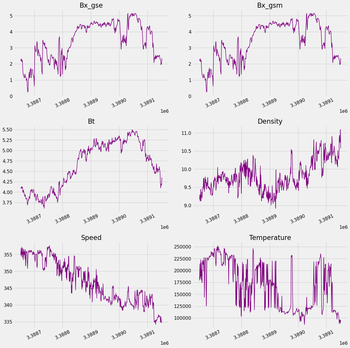
In the given dataset we got many attributes that got to be dealt in different ways, but first we take our numeric attribute and plot them to understand our data set we considered attributes like "bx_gse", "bx_gsm", "bt", "density", "speed" and "temperature"
In this picture when we plot the bx_gse on the basis of solar winds can actually see the relation of speed and bx_gse the maximum count of speed according to this plot is 8
In this picture when we plot the bx_gse on the basis of solar winds can actually see the relation of speed and by_gse the maximum count of speed according to this plot is 7
In this picture when we plot the bx_gse on the basis of solar winds can actually see the relation of speed and bz_gse the maximum count of speed according to this plot is 7
As we can se from the initial study of database and scientific knowledge that density and temperature plays a very vital role in the frequency of speed to relation of density and temperature can be acknowledged by this plot
As we can se from the initial study of database and scientific knowledge that density and bt plays a very vital role in the frequency of speed to relation of density and bt can be acknowledged by this plot which tells us that when bt and density are low the speed is high
As we can se from the initial study of database and scientific knowledge that density and temperature plays a very vital role in the frequency of speed to relation of density and temperature can be acknowledged by this plot which tells us that when bt and temperature are low the speed is high
Based on the analysis and visualization we have trained our model based on the regression Algorithms for which we have used Linear Regression,Ridge and Losso , it tells us by the help of the plot that Linear Regression produces the most accurate r2 score